WHIRLPOOL
PROJECT TYPE
Strategic Sub-Branding & Iconography Development

Whirlpool, the flagship brand of Whirlpool Corporation, is committed to improving everyday life through innovative products that deliver lasting value to consumers. The project focused on developing distinct sub-brand identities across multiple consumer segments, from entry-level to premium offerings, along with a cohesive icon system designed to simplify the consumer experience and enhance product communication.


The design process combined brand analysis, market research, and consumer insights to identify key opportunities. Ideas were explored through sketching, prototyping, and user testing before being refined into the final design solution.
BRAND FOOTPRINT
As part of the research phase, Whirlpool's white goods portfolio was explored across key product categories, including Food Stream Solutions, Fabric Care, Air Treatment, Food Preparation, and Water Care, to gain a deeper understanding of the brand's offerings and consumer needs.

CONSUMER SEGMENT
Consumer research was undertaken to understand Whirlpool's diverse audience across the Good, Better, and Best market segments. The insights informed the development of distinct sub-brand identities tailored to the needs and aspirations of each consumer group.


GOOD
BETTER
BEST
Extensive consumer research and persona mapping informed the redesign of Whirlpool's sub-brands, ensuring each identity reflected the unique needs, aspirations, and preferences of its target audience. By understanding distinct consumer behaviours and purchase motivations, tailored visual languages were developed to strengthen product positioning and enhance brand relevance. The resulting sub-identities catered to diverse market segments while maintaining a cohesive and unified Whirlpool brand experience.


ONLINE SURVEY
An online survey was conducted to gather consumer feedback on the proposed sub-brand identities, evaluating their visual appeal, relevance, and effectiveness in communicating the intended product positioning across different market segments. The insights helped validate the design direction and refine the final sub-brand language to better align with consumer expectations.


Which typeface combination works best for the
sub-brand family
Which of these typefaces in your opinion resonates
as the Sub-Brand for us
MOODBOARD
A mood board was developed to define the new design language for the sub-brand, capturing the aspirations, lifestyle, and visual preferences of the target consumer. Drawing inspiration from contemporary products, fashion, interiors, technology, and automotive design, it established a cohesive direction for the brand identity.

OBSERVATIONS
Based on insights gathered through online surveys, a behavioural mapping framework was developed to understand consumer preferences, purchasing motivations, and expectations. The findings helped identify key patterns across different user segments & informed the development of the sub-brand identities and design language.


Budget-conscious
Seeks dependable everyday performance
Views purchases as long-term investments
Prioritises value for money
Values functionality and reliability
High purchasing power
Value-driven premium choices
Seeks superior performance with differentiation
Preference for modern design + enhanced features
Actively keeps pace with evolving trends
Early adopter mindset - prefers latest innovations
Price is not a constraint
Pays premium for effortless convenience and advanced features
Prefers state-of-the-art, high-performance products
Strong focus on design and seamless interior integration
Seeks products that enhance a refined, luxury lifestyle
ICON DESIGN
The user study helped guide the design of an icon library for Whirlpool products across different consumer segments, ensuring the visual language aligns with varied user needs and expectations. A range of icon styles was explored and tested for clarity and relevance, helping refine a consistent visual system that can be scaled across future product communication and interfaces.
APPLICATION EXPLORATION
FREEZER
CHILLER


DOOR BIN

CRISPER
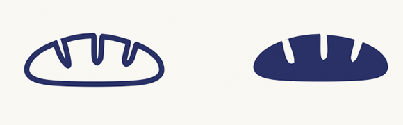
Based on the selected icon language, a comprehensive icon system was developed across multiple product categories to create a consistent and intuitive user experience. The icons were designed to simplify product communication while reinforcing the distinct identity of the Whirlpool brand.
FOOD PRESERVATION
BREAD
EGGS
MILK
ICE CUBES
FISH
FABRICARE
SOAK
BLEACH
BRIGHTNESS
CLEAN
WATER LEVEL
BOIL
BEVERAGE
DELAY
TURNTABLE
FOOD PREPARATION
TIMER
TURBO
AIR TREATMENT
COOL
FILTER
TEMPERATURE
SIMMER
The project reimagined Whirlpool's design ecosystem through consumer-driven sub-brand identities and a unified icon language. By combining market research, behavioural insights, and design exploration, the outcome created a cohesive visual system that strengthened product differentiation while enhancing the overall consumer experience.