INWINDOW OUTDOOR
PROJECT TYPE
Redesign the current brand logo to a more contemporary style

Inwindow Outdoor, a New York based Advertising & Marketing company are the pioneers in Digital Signage and Outdoor Advertising.
They specialise in outdoor advertising solutions, particularly through their innovative technology that convert vacant storefronts into captivating marketing installations.

A variety of symbol concepts were explored as part of redesigning the brand identity for Inwindow Outdoor, experimenting with different visual directions, structures, and ideas to arrive at a solution that effectively represents the brand’s essence and outdoor positioning.
The idea was to create a new identity while still keeping it connected to the current logo for brand recall.


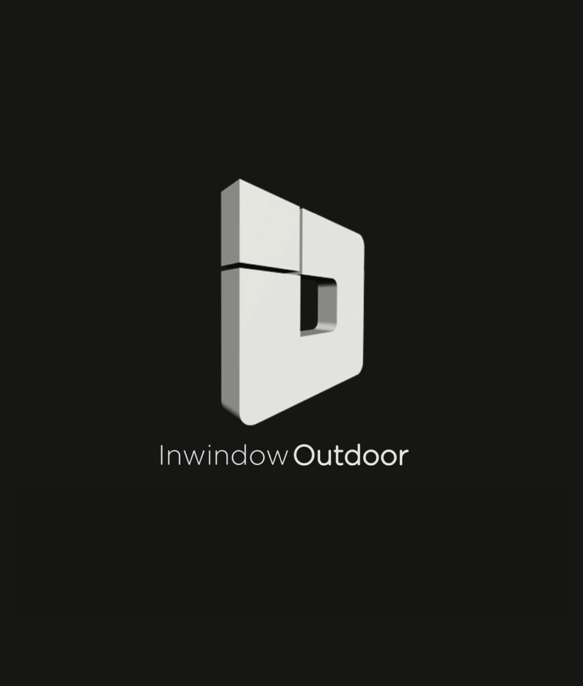
With the company moving toward advanced technologies and modern media platforms, the transition from a 2D to a 3D logo became a thoughtful design decision. It helped translate the brand’s evolution into a more dynamic and immersive visual identity, reinforcing innovation while enhancing its presence across digital touchpoints.
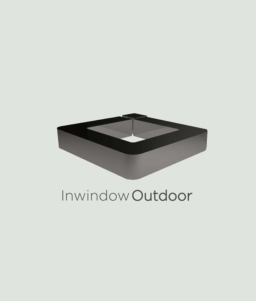
A range of 3D forms were then explored to define the new brand identity.

A wide range of 3D forms and perspectives were explored to establish a distinctive and cohesive visual language for the new brand identity.
Different viewing angles and depth styles were also explored to assess how the forms interact with space, create visual interest, and convey a sense of dynamism. Through this iterative exploration, the goal was to identify a consistent visual style that feels both modern and memorable, while allowing flexibility across different touchpoints and applications.

Explored a range of typefaces for the symbol, refining the selection to achieve a balance between aesthetics and functionality, while ensuring the typography complements and elevates the symbol’s visual language.


Different backgrounds and lighting effects were explored to shape a distinct visual language for the brand, carefully refining elements such as contrast, shadows, and highlights to create a cohesive and engaging visual identity.
Particular attention was given to the interplay of contrast, shadows, and highlights, ensuring that each element not only stands out individually but also contributes to a cohesive overall composition. Subtle shadowing techniques were used to add depth and dimension, while carefully placed highlights enhanced form and guided visual focus.

On exploring various symbols and fonts and rounds of iteration the final look for the new logo was finalised. The new logo is a representation of a digital signage using the company initials "I" and "O"The new identity is modern and contemporary and stands strong like the brand values of the company.